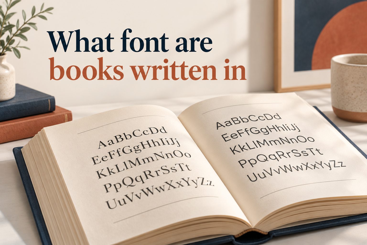
Books are usually written in carefully selected serif fonts, although the exact choice depends on the publisher, genre, format, and reading experience. Common book fonts include Garamond, Caslon, Baskerville, Bembo, Palatino, and Times New Roman. These typefaces are popular because their letter shapes are comfortable to read across long passages. When people ask what font are books written in, they are usually asking about the typefaces used for printed novels, nonfiction books, textbooks, and ebooks. The answer is not one single font. Book typography combines font style, size, spacing, margins, line length, and page design. This article explains the most common fonts used in books, why publishers choose them, how to select the right typeface, and which mistakes writers should avoid when formatting a manuscript.
Why Books Use Serif Fonts
Serif fonts have small finishing strokes at the ends of letters. These details can make printed text feel connected and orderly, helping the reader move smoothly from one word to the next. Although modern books may use many different typefaces, serif fonts remain especially common in long-form publishing.
1. Serifs Support Long Reading
Serif typefaces are designed to create a comfortable rhythm across lines of text. The small strokes help letters appear visually connected without making them difficult to distinguish. This is useful in novels and nonfiction books, where readers may spend several hours reading continuously. The goal is not decoration but steady, low-effort reading.
2. Serif Fonts Look Traditional
Many readers associate serif typography with printed literature, academic writing, and established publishing traditions. A serif font can give a book a serious, literary, or authoritative appearance. This association is one reason publishers often choose classic typefaces for historical fiction, literary novels, essays, biographies, and scholarly works.
3. Serifs Create A Clear Text Texture
A page is not judged only by individual letters. Readers also notice the overall gray texture created by blocks of text. Well-designed serif fonts produce an even texture with balanced spacing. This helps pages look calm and organized, especially when the book contains many paragraphs and relatively few visual elements.
4. Serif Fonts Work Well In Print
Printed pages have physical qualities that influence typography. Ink, paper color, page size, and printing quality all affect how letters appear. Serif fonts are often designed with these conditions in mind. Their proportions and details can remain readable when printed at small sizes, which makes them useful for books with many pages.
5. Serif Fonts Improve Genre Expectations
Typography influences how readers interpret a book before reading it. A refined serif may suggest literary fiction, while a heavier or more traditional design may suggest history or religion. Font choice does not determine a book’s quality, but it can support the tone that the author and publisher want to communicate.
6. Serif Fonts Are Not Always Required
Serif fonts are common, but they are not mandatory. Some books use sans-serif fonts successfully, especially cookbooks, business books, activity books, art books, children’s books, and modern nonfiction. The most important factors are readability, consistency, production requirements, and whether the typeface matches the book’s purpose.
The Most Common Fonts Used In Books
Publishers choose typefaces for their history, readability, personality, and technical performance. The following fonts are among the most recognizable choices for book interiors, although professional editions may use specialized fonts that many readers do not recognize by name.
1. Garamond
Garamond is one of the most popular choices for novels and literary books. It has elegant proportions, distinctive letter shapes, and a warm traditional appearance. Several versions exist, including Adobe Garamond and EB Garamond. Because Garamond is relatively compact, it can fit more words on a page without appearing cramped.
2. Baskerville
Baskerville has a refined contrast between thick and thin strokes. It often looks more formal and polished than ordinary office fonts. Its strong readability makes it suitable for novels, essays, biographies, and books that need a sophisticated but approachable visual style. Baskerville can work especially well when a publisher wants classic typography with a clean appearance.
3. Caslon
Caslon is a historic typeface that has been used in books for centuries. It has an inviting, slightly old-fashioned character and is often associated with traditional publishing. Caslon’s letterforms are comfortable for extended reading, making it useful for fiction, history, religion, and literary nonfiction. Its varied versions may look noticeably different from one another.
4. Bembo
Bembo is known for its graceful, balanced letterforms and excellent performance in continuous text. It has a literary quality without feeling overly decorative. Publishers often use it for novels, poetry, essays, and high-quality paperback or hardcover editions. Bembo can produce attractive pages, although its generous proportions may require more space.
5. Palatino
Palatino is a versatile typeface with a broad, friendly appearance. It is often used in books, reports, academic documents, and personal publishing projects. Because the letters are open and relatively large-looking, Palatino can remain readable for people who prefer a more spacious page. It may use more pages than a compact typeface.
6. Times New Roman
Times New Roman is widely recognized because it is included with many word-processing programs. It is readable and practical, but it is more common in manuscripts, academic assignments, and business documents than in professionally designed trade books. Authors may use it while submitting a manuscript, but the publisher may replace it during final typesetting.
7. Minion
Minion is a modern serif typeface designed for clear, flexible text setting. It is frequently used in books, magazines, academic publications, and digital reading environments. Its balanced appearance allows it to support both traditional and contemporary designs. Minion is a strong option for authors who want a professional look without an overly distinctive style.
How Font Choice Affects Book Readability
Font selection is only one part of readable typography. A beautiful typeface can still create a poor reading experience if it is used at the wrong size or combined with unsuitable spacing. Readers experience the complete page design rather than the font in isolation.
1. Letter Shape Matters
Some fonts have open counters, clear distinctions between similar letters, and comfortable proportions. These features help readers recognize words quickly. Fonts with cramped interiors, unusual shapes, or excessive decoration may slow reading, even if they appear attractive in a sample heading.
2. Font Size Changes The Experience
Most printed books use a text size somewhere around 10 to 12 points, but the ideal size depends on the font and page design. A 10-point font may look larger or smaller depending on its proportions. Children’s books, large-print editions, and books for older readers normally use larger type.
3. Line Spacing Prevents Crowding
Leading is the space between lines of text. If lines are too close, readers can lose their place while moving from the end of one line to the beginning of the next. If lines are too far apart, the page may feel disconnected. Good book typography uses enough space for easy tracking without wasting valuable page area.
4. Line Length Controls Eye Movement
Very long lines can make reading tiring because the eye must travel farther and then locate the next line. Very short lines create frequent breaks and may make the page feel choppy. Book designers choose page width, margins, and font size together to create a comfortable line length.
5. Contrast Must Be Balanced
Strong contrast between text and paper improves readability, but harsh visual contrast can feel uncomfortable for some readers. Black text on warm white or cream paper is common in printed books because it offers clear visibility while appearing softer than bright white paper with extremely dark ink.
6. Consistency Builds Confidence
Readers should not have to adjust to a new body font on every page. A book should use a consistent typeface, size, line spacing, and alignment for its main text. Variations are appropriate for chapter titles, quotations, captions, and notes, but they should follow a clear visual system.
Book Fonts For Different Genres
The best font depends partly on the kind of book being published. A typeface that works beautifully for a literary novel may be unsuitable for a technical manual or illustrated children’s book.
1. Fiction And Novels
Novels commonly use readable serif fonts with a traditional or understated personality. Garamond, Caslon, Baskerville, Bembo, and Minion are frequent choices. The design usually focuses on uninterrupted reading, with modest chapter headings and limited visual distractions.
2. Nonfiction Books
Narrative nonfiction often uses the same principles as fiction, while business and practical books may use a combination of serif and sans-serif fonts. A serif font can handle body text, while a sans-serif font may be used for headings, sidebars, labels, or exercises.
3. Academic And Scholarly Books
Academic books prioritize clarity, references, footnotes, tables, and complex structural elements. Fonts must remain readable at smaller sizes and work well with mathematical symbols, citations, headings, and notes. The final design may be more formal and information-dense than a commercial novel.
4. Children’s Books
Children’s books use fonts that are clear, friendly, and appropriate for the reader’s age. Early readers may need large type, generous spacing, and letterforms that resemble those taught in school. Picture books often use typography as part of the visual artwork rather than relying on a standard text block.
5. Poetry Collections
Poetry typography must respect line breaks, stanza shapes, indentation, and white space. A font should support the poet’s voice without overpowering the arrangement of the poem. Designers may choose a traditional serif, a modern sans-serif, or a specialized display face depending on the collection.
6. Technical And Instructional Books
Technical books often need strong hierarchy and quick navigation. Sans-serif fonts may appear in diagrams, labels, and headings, while serif fonts remain useful for longer explanations. The most important priorities are clarity, consistent terminology, accessible formatting, and easy scanning.
How Publishers Choose A Book Font
Professional typesetting is a deliberate process. Publishers usually consider the manuscript, intended audience, trim size, printing budget, page count, and visual identity before selecting a typeface.
1. Review The Book’s Tone
A font should support the emotional and intellectual character of the book. A historical novel might benefit from a classic typeface, while a contemporary technology guide may need something cleaner and more modern. The font should feel appropriate without becoming a distraction.
2. Test The Font In Real Pages
A typeface can look excellent in a font menu but behave differently in a full chapter. Designers test sample pages to evaluate paragraph texture, line breaks, chapter openings, headings, quotations, and page density. This reveals practical issues that are invisible in a single sentence.
3. Check The Page Count
Some fonts are compact, while others occupy more horizontal or vertical space. A small change in typeface can add dozens of pages to a long manuscript. Publishers balance readability with printing costs, binding requirements, and the desired physical size of the finished book.
4. Consider The Paper
Cream paper, white paper, coated paper, and uncoated paper affect how type appears. Fine details may print differently depending on the paper and ink. A font that looks elegant on screen may lose subtle features when printed, so physical proofs are valuable.
5. Examine Special Characters
Books may include accented letters, symbols, scientific notation, foreign languages, or unusual punctuation. The chosen typeface must support all required characters consistently. Missing glyphs or mismatched symbols can make a professionally edited book look unfinished.
6. Review The Complete System
A book normally needs more than a body font. The designer may need italics, bold styles, small capitals, numerals, chapter titles, running heads, captions, and footnotes. A strong type family makes it easier to build a consistent hierarchy throughout the publication.
Formatting A Manuscript Before Submission
Authors preparing a manuscript should focus on clarity rather than trying to imitate the finished book. Publishers and editors often prefer simple formatting because it makes the text easier to review and edit.
1. Use A Standard Readable Font
A manuscript can usually be prepared in a familiar font such as Times New Roman, Arial, or another clearly readable typeface. The exact requirement may vary by publisher, agent, school, or self-publishing platform. Always follow the requested submission guidelines when they are available.
2. Keep Formatting Consistent
Use the same body font, paragraph alignment, spacing, and indentation throughout the manuscript. Avoid changing fonts to represent mood or emphasis. Those decisions are normally handled during design and typesetting, while the manuscript should communicate the words and structure clearly.
3. Avoid Decorative Fonts
Script, novelty, handwriting, and highly stylized fonts can make a manuscript difficult to evaluate. Even if they fit the subject, they may slow reading and create formatting problems. Decorative typefaces are better reserved for carefully designed covers, special headings, or selected visual elements.
4. Use Italics Carefully
Italics are useful for emphasis, foreign words, thoughts, titles, and certain conventional expressions. Overusing them weakens their effect and can make pages harder to read. Authors should apply italics consistently and avoid using underlining or excessive bold formatting unless required.
5. Separate Chapters Clearly
Each chapter should begin in a predictable way, usually on a new page. A simple chapter title and consistent spacing are enough for a manuscript. The publisher may later redesign chapter openings, add ornaments, adjust alignment, or select a different display typeface.
6. Do Not Judge The Final Book By The Manuscript
The submitted document and the finished book serve different purposes. A manuscript is an editing tool, while a typeset book is a designed reading experience. A plain manuscript font does not mean the final publication will use that same typeface.
Common Book Font Mistakes To Avoid
Font mistakes can affect readability, page count, professionalism, and the relationship between the book’s design and its content. Most problems are easy to prevent when authors test their choices on complete pages.
1. Choosing A Font Because It Looks Attractive
A font may look beautiful in a heading but become tiring across hundreds of pages. Always test several pages of ordinary body text. The right question is whether readers can continue comfortably, not whether the letters look impressive in isolation.
2. Using Too Many Fonts
Multiple typefaces can make a book feel disorganized. Most interiors need one body font and perhaps one complementary font for headings or special elements. Too many styles compete for attention and make the design look accidental rather than intentional.
3. Making The Text Too Small
Reducing the font size to lower the page count can damage the reading experience. Small text may be especially difficult for older readers or anyone reading in poor lighting. A modest increase in size is often more valuable than saving a few pages.
4. Ignoring The Font’s Real Size
Two fonts set at the same point size may not appear equally large. Their height, width, and internal proportions can differ substantially. Compare actual pages rather than relying only on numerical settings when deciding whether text feels comfortable.
5. Using Decorative Body Text
Highly decorative typefaces can reduce reading speed and make a serious book seem amateurish. Their unusual letterforms may also create spacing and printing problems. Use distinctive fonts sparingly, mainly for titles or selected design accents.
6. Forgetting Italic And Bold Styles
A font family should include reliable italic and bold versions when the book needs them. Substituting a different font or forcing artificial styles can create inconsistent letters. Check quotations, emphasis, headings, and notes before finalizing the interior design.
Best Practices For Choosing A Book Font
A thoughtful font decision balances reader comfort, genre expectations, production needs, and the book’s personality. These practices can help authors and designers make a confident choice.
1. Start With Readability
Begin by testing whether the font is comfortable at the intended size. Read several pages rather than judging a single line. If your eyes feel tired, the letters seem crowded, or you frequently lose your place, the font or spacing needs adjustment.
2. Test Printed Pages
Screens display type with light and sharpness that paper does not reproduce exactly. Print sample pages using the intended paper size and approximate margins. This simple test often reveals whether the text is too small, too dark, too loose, or too dense.
3. Match The Genre
Choose a typeface that supports the reader’s expectations. A classic serif may suit a literary novel, while a clean sans-serif may suit a contemporary guide. The choice should feel natural for the subject without relying on stereotypes or excessive visual effects.
4. Protect The Reading Rhythm
Check line length, leading, paragraph indentation, and page breaks together. A readable font cannot compensate for lines that are too long or spacing that is too tight. Typography works as a system, so every adjustment should be evaluated within the complete page.
5. Consider Accessibility
Use clear letterforms, adequate size, good contrast, and comfortable spacing. Readers have different visual needs, and accessibility should be considered from the beginning. Large-print editions, ebooks, and digital platforms may require additional adjustments beyond the design of a standard print edition.
6. Get An Outside Opinion
Ask several people to read sample pages without explaining which font you prefer. Notice whether they find the page comfortable, formal, modern, crowded, or tiring. Their reactions can reveal practical issues that are easy to miss when you are emotionally attached to a design.
7. Prioritize The Whole Book
The strongest font is the one that works across chapters, quotations, notes, headings, tables, and special characters. A typeface may be attractive in the opening pages but unsuitable for later sections. Review representative pages from throughout the manuscript before making a final decision.
Practical Examples Of Book Font Choices
Examples make it easier to see why different books require different typographic decisions. There is no universal winner because each project has its own audience and physical requirements.
1. A Literary Novel
A literary novel might use Garamond or Bembo at a comfortable size with moderate leading and generous margins. The design would usually be quiet, allowing the story to remain central. Chapter titles might use the same family in small capitals or a restrained complementary style.
2. A Historical Biography
A biography could use Caslon or Baskerville to create an established, trustworthy feeling. Footnotes, photographs, captions, and archival quotations would need their own hierarchy. The body text should remain easy to read even when the subject matter is information-rich.
3. A Business Guide
A business book may combine a readable serif body font with a clean sans-serif for headings, callouts, charts, and exercises. This combination supports both extended reading and quick scanning. Strong hierarchy helps readers find strategies, summaries, and practical actions.
4. A Children’s Early Reader
An early reader needs large, clear type, generous line spacing, and simple page layouts. Letterforms should be easy to distinguish, especially for children still learning to read. The font must work with illustrations and should not compete with the story or visual cues.
5. A Poetry Collection
A poetry book may use a typeface with graceful proportions and enough flexibility for unusual line lengths. The designer must protect intentional spacing and stanza structure. Page breaks should be reviewed carefully because changing the layout can alter how a poem is experienced.
6. An Academic Textbook
A textbook may use a highly readable serif for explanations and a sans-serif system for headings, labels, examples, and diagrams. Tables and formulas require careful alignment. The design should support both concentrated reading and rapid reference during study.
Frequently Asked Questions
1. What Font Are Most Novels Written In?
Most novels use readable serif fonts such as Garamond, Caslon, Baskerville, Bembo, Minion, or similar typefaces. The exact choice depends on the publisher and the book’s design. Authors may submit manuscripts in a standard font, but the final printed edition is usually typeset in a professionally selected book face.
2. Is Times New Roman A Good Font For A Book?
Times New Roman is readable and practical, especially for manuscripts, school assignments, and documents. However, it is not always the preferred choice for a professionally designed book interior. Publishers may choose a typeface with a more distinctive literary character, better page texture, or more efficient use of space.
3. What Font Size Is Common In Printed Books?
Printed books often use text between approximately 10 and 12 points, although the ideal size depends on the typeface, audience, paper, and page dimensions. Children’s books and large-print editions use larger text. Point size should always be judged by the actual appearance and comfort of complete pages.
4. Are Books Always Written In Serif Fonts?
No. Serif fonts are common for long-form printed text, but books can also use sans-serif fonts. Modern nonfiction, children’s books, cookbooks, art books, workbooks, and technical publications may use sans-serif typography. The best choice depends on readability, genre, layout, audience, and the role of visual design.
5. What Font Should An Author Use For A Manuscript?
Authors should use the font requested by the publisher, agent, contest, or submission system. When no specific requirement exists, a plain, readable font with consistent spacing is usually appropriate. The manuscript should be easy to edit and review rather than designed to look like the final printed book.
6. Does The Font Change The Number Of Book Pages?
Yes. Fonts differ in width, height, spacing, and line efficiency, so they can create different page counts even at the same point size. A larger or more spacious typeface may increase the number of pages, while a compact font may reduce it. Readability should remain more important than minimizing pages.
Conclusion
Books are written in many different fonts, but the most common choices are readable serif typefaces such as Garamond, Caslon, Baskerville, Bembo, Palatino, and Minion. These fonts are valued for their comfortable letterforms, traditional appearance, and ability to support long periods of reading. Times New Roman is also widely used for manuscripts, although publishers often select a different typeface for the finished edition.
The best book font depends on more than personal taste. Genre, audience, page size, paper, spacing, accessibility, production costs, and the book’s overall tone all matter. Whether you are preparing a novel, textbook, biography, poetry collection, or practical guide, test the font on complete pages and judge the entire reading experience. A successful typeface quietly supports the words, allowing readers to focus on the ideas and story rather than the design.